Inayaili de León Persson
on 26 January 2012
Some guidelines for warm grey text on the web
Warm grey is one of the neutral colours from Ubuntu and Canonical’s colour palette. It has been added to the palette for balance, being a bridge between the vibrant orange and aubergine.
The brand guidelines specify that warm grey (hex value: #AEA79F) can be used for: backgrounds, graphics, pictograms, dot patterns, charts and diagrams, and large size text.
Even though its use has been tried and tested on some of our print design materials, we are still finding the best way of applying it on the screen, with accessibility considerations in particular being something we want to get right.
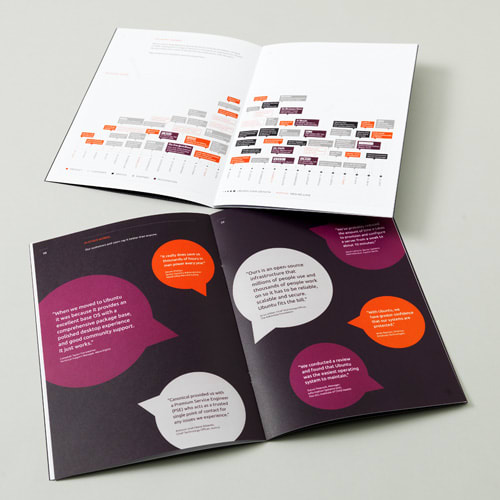
Warm grey used in a brochure spread and diagrams
I made a quick example of warm grey text on white and buttons with white text on warm grey and showed it to the Ubuntu accessibility team, who promptly gave me some feedback.
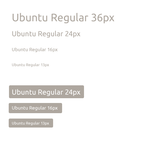
Example used to showcase warm grey text on white and white text on warm grey
Here are the conclusions of this discussion, and what we will now try to follow as a rule:
- Warm grey is easier to read on white and at larger sizes, such as 24-36px
- It can be used for short, less important pieces of information (for example the date or author of a post or news piece below the main title)
- It can also be used in buttons that are deactivated and therefore less relevant
Guidelines can change though. If something doesn’t evolve, or is at least reassessed at certain intervals of time, it can very easily stagnate. So we will test these conclusions and follow these simple rules for now, knowing that later on we may decide there is a better way of achieving the same results.