Will Grant
on 11 July 2022
We try hard to make our products as intuitive and familiar as possible, but there will always be “advanced” options and rarely-used features. Giving users choice and control over their experience will naturally lead to features that are used less frequently or settings that only a small percentage of users will change.
So how do we decide what order and prominence to give to these lesser-used features?
One method to help decide where (and how prominently) a control or interaction should be placed, is to classify interactions into one of three types:
Obvious, Easy and Possible.
Let’s take a look at the Ubuntu Advantage user interface:

There’s lots going on here, so let’s look at the “Obvious, Easy, Possible” classification:
Obvious: Obvious interactions are the core function of an app, for example, the shutter button on a camera app or the new event button on a calendar app. They’re the functions that users will likely perform every time they use your product and their controls should be visible and intuitive. Hiding these away — either accidentally or intentionally — does still happen and it’s often a cause of massive frustration for users and the failure of new products.
Easy: An easy interaction could be switching between the front-facing and rear-facing lens in a camera app, or editing an existing event in a calendar app. The controls should be easily found, perhaps in a menu or as a secondary-level item in the main controls. They’re the toughest to get right because they’re used too frequently to be tucked away, but they are not used every time, which means designers will often de-prioritise them too heavily.
Possible: Interactions we classify as possible are rarely used and they are often advanced features. They need to be discoverable, but they shouldn’t be given the same prominence as obvious or easy interactions. For example, it is possible to adjust the white balance or auto-focus on a camera app, or make an event recurring on a calendar app. These advanced controls can be tucked further away, as the majority of users will not need to see their UI cluttered with them.
Applying this to our case on Ubuntu Advantage, we can see how these areas have been ordered and styled:
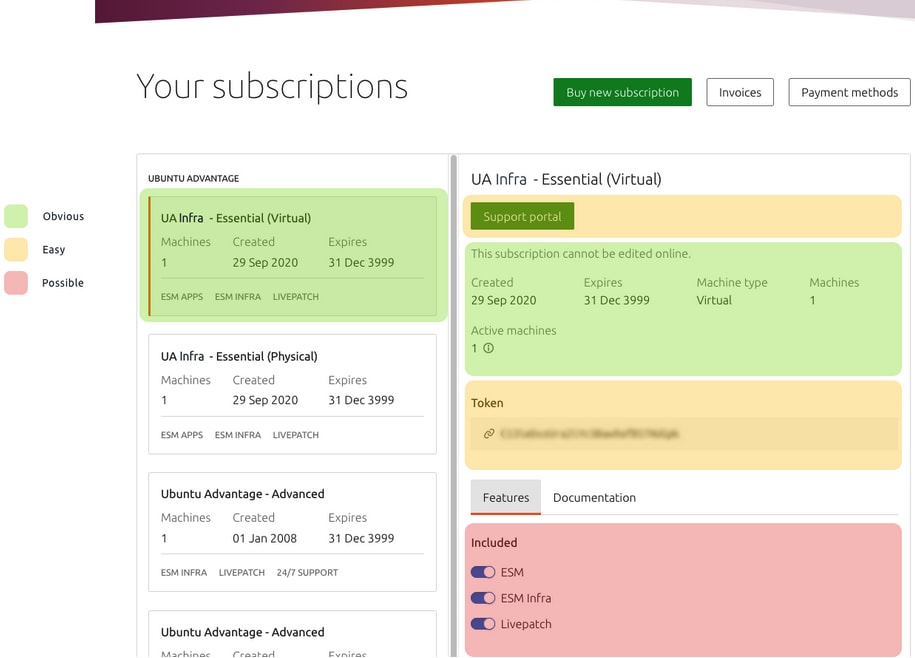
Obvious
We want users to be shown their most recent Ubuntu Advantage subscription, as well as immediate information like its expiry date and the number of machines attached. This will help the user know they’re dealing with the right subscription.
Easy
The next category of frequently-used features includes the “Support portal” button – letting our users get the most out of their subscription by searching the knowledge base or opening support tickets.
We also expose the user’s Token at this level. They’ll definitely need it at least once to copy and paste into their Ubuntu machines – but they probably won’t need it every time they sign in.
Possible
Each subscription has a set of optional features that can be enabled and disabled. It’s possible to get to these quite easily, but they’re not “front and centre” – users will likely use these controls only once – or not at all.
Making these design decisions isn’t always easy and often we’ll only get it right after a few rounds of testing and iteration.
Thanks to our User Interview Group we have a thriving community of 100s of customers who are ready and willing to take part in user interviews (you can join the group if you’re interested).