Andrea Bernabei
on 8 August 2016
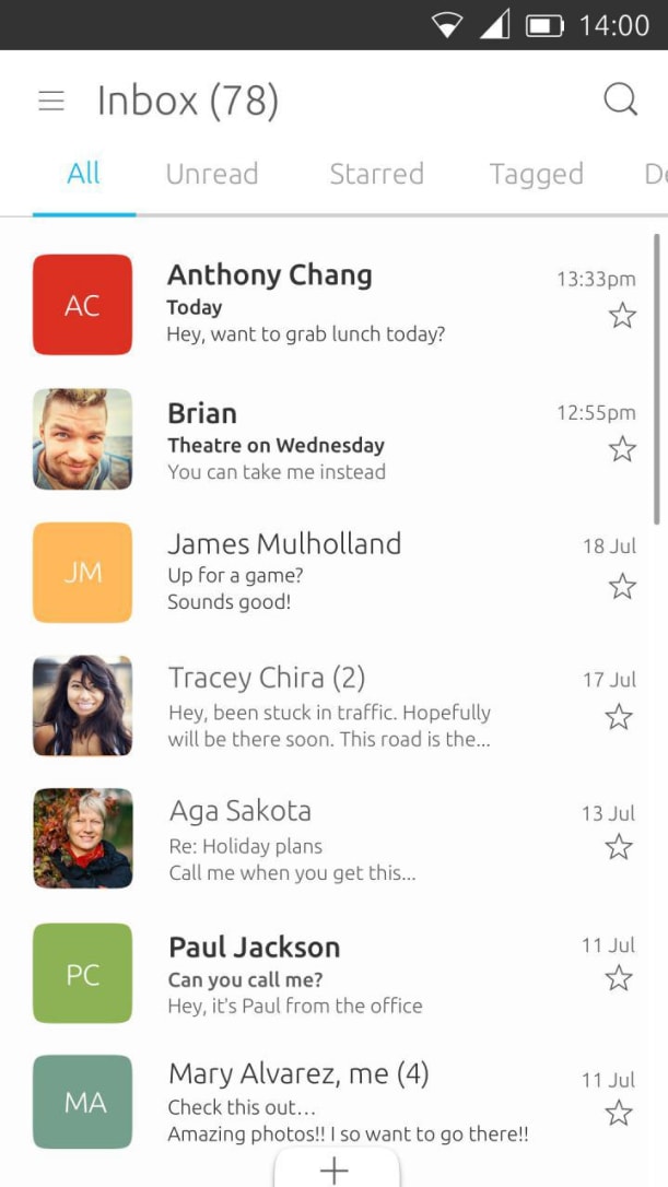
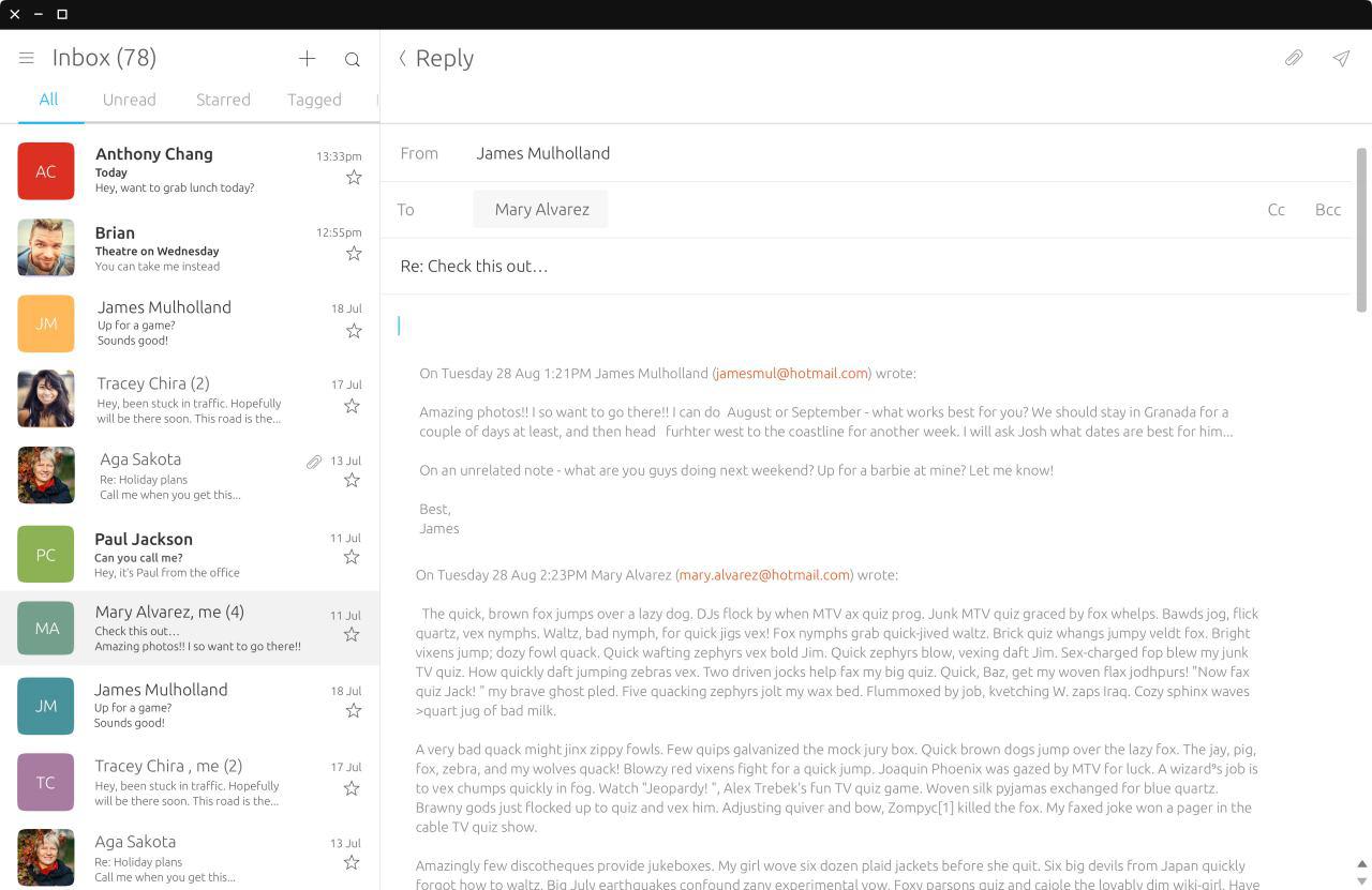
You may have noticed that the scrollbars available on Ubuntu Touch and the Unity8 environment have recently received a huge overhaul in both visual appearance and user experience. More specifically, we redesigned the Scrollbar component (which is already provided in the Ubuntu UI Toolkit) and added a new ScrollView component that builds on top of it and caters for convergence.
Technical note to app developers: the Scrollbar component is still available for compatibility purposes, but we recommend transitioning to the new and convergent ScrollView.
How did we do it?
The process was as follows:
- Interaction design was specified
- Applied visual style to the component
- Prototyped the component
- Iterated over design and performed user testing
- Sent for review to the SDK team and integrated into the UI toolkit.
We started by researching the field, exploring the possibilities and thoroughly analyzing the history of the scrollbar component. The output of this step was an interaction specification. The visual design team picked that up and applied our visual style to the component, ensuring a consistent visual language across all the elements provided by the UI Toolkit.
Once we had a first draft of the interaction and visual specs, we created a prototype of the component.
We then iterated over the design choices and refined the prototype. While iterating we also took into account the results of the user testing research that we conducted in the meanwhile. The testers found the new scrollbars easy to use and visually appealing. The only pain point highlighted by the research were the stepper buttons, that were deemed a bit small. We refined them by creating a new crispier graphic asset and by tweaking their size as well as the visual feedback they provided, especially when being hovered with a mouse.
Once we were happy with the result, we submitted our work to be reviewed by the SDK team. The SDK team are the final gatekeeper and decide whether the implementation of a component is ready to be merged to the UI Toolkit or not. The review process can be lengthy, but it is of great help in ensuring a higher code quality, less bugs and clearer documentation. Once the SDK team gave the green light, the component was merged to the next release of the UI Toolkit.
What did we change?
A critical requirement of the new solution was to be “convergence-ready”. Convergence means implementing a UI that scales not just across form factors, but also across different input devices. This is particularly important in the case of scrolling, as it must be responsive to all input devices.
The new ScrollView can be interacted with using the touchscreen of your phone or tablet, but thanks to convergence, now your tablet can turn into a full fledged computing device with a hardware keyboard and a pointer device, such as a mouse. The component must be up to the task and adapt to the capabilities provided by the input device which is currently in use.
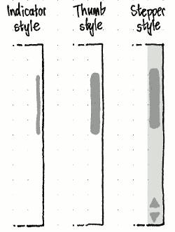
At any time, the new scrollbar can be in one of the 3 following modes:
- Indicator mode, where the scrollbar is a non-interactive visual aid;
- Thumb mode, that allows quick scrolling using a touch screen;
- Steppers mode, optimized for pointer devices interactions.
Let’s go through the modes in more detail.
Indicator mode
Whenever the user scrolls content without directly interacting with the scrollbar, i.e. he or she performs a flick or uses the mouse wheel or keyboard keys, the scrollbar gently fades in as an overlay on top of the content. In this mode the scrollbar is not interactive, and just acts as a visual aid to provide information about the position of the content. The indicator gently fades out following a short timeout after the surface stops scrolling.
Please note: we will be replacing these images with GIFs soon.

Thumb mode
Imagine you want to send a picture to a friend of yours, but the file is somewhere down the very lengthy grid of pictures. Let’s also suppose you’re using a smartphone or tablet and you have no mouse or keyboard connected to it. Wouldn’t it be handy to have a way to quickly scroll a long distance without having to repeatedly flick the list? We designed Thumb mode to address that use case.
When the content on screen reaches a length of 10 or more pages, the thin indicator provided by the indicator mode grows thicker into an interactive thumb. That marks the transition to the Thumb mode. While the scrollbar is in Thumb mode you can drag the thumb using touchscreen to quickly scroll the content.
The component still fades out when the user stops interacting with the surface and the surface stops scrolling, in order to leave as much real estate to the application content as possible.
Stepper mode

When the user is interacting with the UI using a pointer device, they expect a different experience than a touchscreen. Pointer devices allow for much more precise interactions and also provide different ways of interacting with the UI components, such as hovering. A good convergent component exploits those additional capabilities to provide the best user experience for the input device which is currently in use.
When the user hovers over the area occupied by the (initially hidden) scrollbar, the bar reveals itself, this time in what we call Stepper mode.
This mode is optimized for pointer device interactions, although it can be interacted with using touchscreen as well. More generally, for a component to be defined convergent the user must be able to start interacting with it using one input device (in this case, a mouse) and switch to another (e.g. touch screen) whenever they wish to. That transition must be effortless and non disruptive.
When in Stepper mode, the scrollbar has a thick and interactive thumb. This is similar to the Thumb mode we presented in the previous section. However, Stepper mode also provides a semi-transparent background and the two clickable stepper buttons desktop users are already accustomed to. The steppers buttons can be clicked to scroll a short distance. Holding a stepper button pressed will scroll multiple times.
The areas above and below the thumb are also interactive. You can click/tap or press-and-hold to scrolling by one or more pages.
Once the user moves the pointer away from the scrollbar area and the surface stops scrolling, the component elegantly fades out, just like in the other modes.
Visual convergence
We put a lot of efforts into making the transitions between the different modes as smooth and visually pleasing as possible. The alignment of the sub components (the thumb, its background, the stepper buttons), their sizes, their colours have been carefully chosen to achieve that goal.
When the bar grows from Indicator to Thumb modes and vice versa, it does so by anchoring one side and expanding only the opposite one. This minimizes unexpected movements and produces a simple yet crisp animated transition. Those same principles also apply to the transitions from thumb to stepper modes and indicator to stepper and vice versa. We wanted to create transitions that would look elegant but not distrustful.
The new scrollbar also provides visual aids to indicate when a pointer device is hovering over any of the sub components. Both the stepper buttons and the thumb react to hovering by adjusting their colours.

Interaction handling convergence
A lot of effort has gone into tweaking the interactions to provide an effortless interaction model. Here’s a summary of how we handle touch screen and pointer devices:
- Thumb mode features a thicker interactive thumb to allow quick scrolling using touch screen;
- Press-and-holding the steppers buttons provides an effortless way to perform multiple short scrolls;
- Press-and-holding the areas above and below the thumb makes provides easy multiple page scrolling;
- Mouse hovering is exploited to reveal or hide the scrollbar;
- Visual feedback on press/tap;
- Visual feedback on pointer device hover.
It is a lot of small (and sometimes trivial!) details that make up for a great user experience.
Some of you might be wondering: “what about keyboard input?”
I’m glad you asked! That is an important feature to realize full convergence. The ScrollView components handles that transparently for you. Scrolling content using the keyboard is just as easy as scrolling using the touchscreen or any pointer device:
- Arrow keys trigger a short scroll;
- PageUp/PageDown trigger a page scroll;
- Home/End keys trigger scrolling to the top/bottom of the content, respectively
- Holding a key down triggers multiple scrolls;
What did we achieve?
The new scrollbars fully implement our vision of convergence. The user can interact with any of the input device he has available and switch from one to the other at any time. The interactions feel snappy and we think the component looks great too!
We can’t wait for you to try it and let us know your opinion!
What does the future hold?
The focus so far has been on getting the right visual appearance and user experience.
However, in order to have a complete solution, we also need to make sure adding such a feature as scrollbars to the applications does not come with a big performance drawback. Ideally, all the scrollable surfaces (images, text fields, etc) should include a scrollbar and that means it’s very important to provide a component that is not just easy to use and visually appealing but also extremely performant.
There are two main aspects where the performance of this component comes into play: the performance of interactions, so that they happen immediately and without unexpected delays. I believe we’re in a very good shape there. The second is: the time it takes to create a scrollbar when an application needs one; this affects application startup time and the time it takes to load a new view that holds scrollable content.
A few changes have already been implemented, which has resulted in a speed-up of about 25%. These changes should be released with OTA13.
If you have ideas or want to provide any feedback, here are the contact details of the people who worked on this project.
- Andrea Bernabei, UX engineer.
- Matthew Paul Thomas, interaction designer
- Jouni Helminen, Lead visual designer.
IRC: #ubuntu-touch channel on FreeNode server
Alternatively, start a thread on the ubuntu-phone mailing list.


