Inayaili de León Persson
on 3 January 2013
As you’ve probably seen, Canonical has just announced Ubuntu on phones. We’re all very excited about it, especially since so many of us have been working hard on this project. Here’s an insight into the design of the new phone pages on ubuntu.com.
Deciding what to say
The tricky part when designing pages to show off something really cool is choosing which of the many interesting aspects to highlight, and how to express them. We wanted to convey the beauty of Ubuntu on phones, as well as all of the effort it took to create it, but it was vital that the message was coherent and useful for the main target audience in this phase of development: phone operators and manufacturers who might want to partner with us.
 A low-fi countdown in the office
We had a lot of meetings and discussions with key stakeholders within Canonical to understand what was important to convey on these pages. We also relied on pre-existing business-focused personas to have a good grasp at what these type of visitors would be looking for when they landed on this section of the site. Finally, we were in constant touch with the designers that worked on the phone project to understand what they felt were the key aspects of the visual design and interactions, and how we should be talking about them, illustrating them and linking them together.
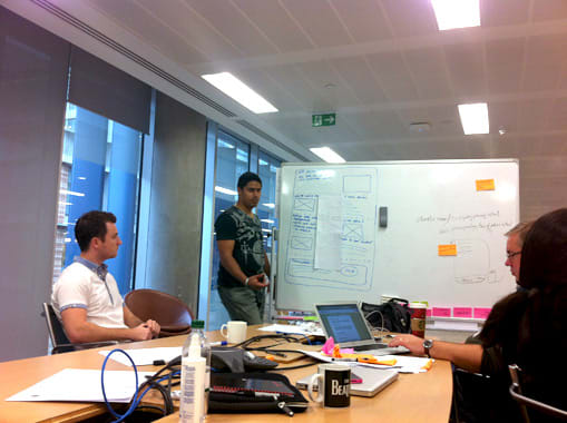 One of the several meetings we participated in
The structure and overall topics of these pages developed naturally from the conversations we had with everyone and amongst ourselves, and the idea was to keep it as simple as possible, with as few pages as possible. The key page topics would be:
- Overview
- Design and experience
- Operators and manufacturers
- Developers
- Get in touch
Pen and paper
With all this information, we needed to start putting our thoughts and ideas into physical format. There’s nothing better for that than pen and paper, and we went through many iterations and many sheets of paper!
The main goals for this stage were:
- Understand if the page flow worked well
- Create an outline of the content so we could flesh it out
- Have a better understanding of which assets we’d need to source or create
- Explore ideas for some animations and interactions we wanted to incorporate in the pages
 Just a fraction of the sketches we produced
Everyone in the team, from developers to designers, participated in the sketching sessions and shared their ideas. Soon after we started, some patterns started to emerge and we were able to focus on the best solution for each page.
Keeping it simple
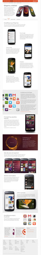
Visually, the new phone pages keep in line with the Ubuntu brand and overall visual direction of the rest of the site. We were lucky that we had so many great images to work with, and we wanted them to really shine. We kept the pages simple and clean and focused on establishing a good pace on a solid grid, something that is particularly visible in the Design page.
Because a phone experience is driven through its interactions, we felt it was appropriate to add animations to illustrate some of the points explained in the Design page. We also thought it would be nice if visitors could repeat the animations in case they missed them the first time, so in the “Everything at your fingertips” section we’ve included a little “repeat animation” icon and the animation in the “Find anything, anywhere, instantly” section can also be triggered on hover.
 The animations can be replayed
We have also introduced shapes inspired in the Ubuntu font, which are present in the phone designs too.
 New shapes in buttons and icons
As a nod to the phone’s home screen filters, we’ve used a similar device to aid navigation between the pages of this section. This element uses the same orange strip to indicate which page you’re visiting.
 The navigation device on the phone pages (top) is influenced by the phone’s page indicator (bottom)
Happy new year!
Ubuntu on phones is the product of the combined (and huge) effort across several teams within Canonical. We had a great time designing and building the pages that showcase it to the world, so hopefully you’ll enjoy the result 🙂