Your submission was sent successfully! Close

Thank you for signing up for our newsletter!
In these regular emails you will find the latest updates from Canonical and upcoming events where you can meet our team.Close

Thank you for contacting us. A member of our team will be in touch shortly. Close

  1. Blog
  2. Article

Canonical
on 16 July 2015


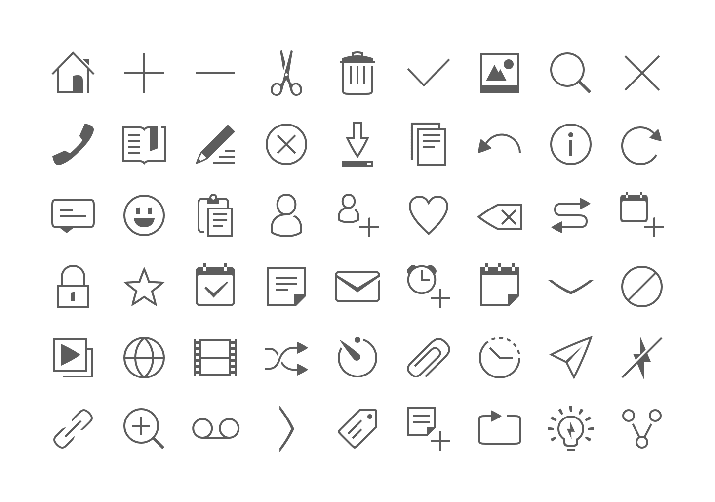
We have given our monochromatic icons a small facelift to make them more elegant, lighter and consistent across the platform by incorporating our Suru language and font style.

The rationale behind the new designs are similar to that of our old guidelines, where we have kept to our recurring font patterns but made them more streamlined and legible with lighter strokes, negative spaces, and a minimal solid shape.

What we have changed:

  • Reduced and standardized the strokes width from 6 or 8 pixels to 4.
  • Less solid shapes and more outlines.
  • The curvature radius of rectangles and squares has been slightly reduced (e.g message icon) to make them less ‘clumsy’.
  • Few outlines are ‘broken’ (e.g bookmark, slideshow, contact, copy, paste, delete) for more personality. This negative space can also represent a shadow cast.


Less solid shapes

Before

After

Lighter strokes


Before

After

Negative spaces


Before


After


Font patterns 

Oblique lines are slightly curved

Arcs are not perfectly rounded but rather curved


Uppercase letters use right or sharp angles

Vertical lines have oblique upper terminations.

Nice soft curves


Action
Devices

Indicators

Weather

Related posts


piperdeck
20 January 2025

An Introduction to Open Source Licensing for complete beginners

Design Article

Open source is one of the most exciting, but often misunderstood, innovations of our modern world. I still remember the first time I installed linux on my laptop, saw the vast array of packages I could install on it, all the utilities and libraries that make it work, all the forum threads filled with advice ...


Maximilian Blazek
6 November 2024

Designing Canonical’s Figma libraries for performance and structure

Design Article

How Canonical’s Design team rebuilt their Figma libraries, with practical guidelines on structure, performance, and maintenance processes. ...


Julie Muzina
13 August 2024

Visual Testing: GitHub Actions Migration & Test Optimisation

Design Article

What is Visual Testing? Visual testing analyses the visual appearance of a user interface. Snapshots of pages are taken to create a “baseline”, or the current expectation of how each page should appear. Proposed changes are then compared against the baseline. Any snapshots that deviate from the baseline are flagged for review. For example ...