Canonical
on 15 September 2010
We are familiar with the Latin alphabet; we are used to seeing it’s forms and shapes and we read it without thinking. When we design Latin fonts, we can rely on our intuition and experience to create the letter shapes; we feel when a character is right or wrong. When designing a non-Latin typeface we can draw on our experience of drawing letterforms but it is important that we research and explore the calligraphic history of the relevant script to ensure our interpretation of the script is correct. In addition we work with a design professional native to the respective script, someone who has affinity for type, understands legibility, and also is able to see the design in the context of its need to match Latin as well as maintaining cultural integrity.
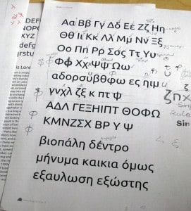
When we design non-Latin scripts we know that each has different structural and textural characteristics. The Cyrillic alphabet for example has a more static and square appearance, and because of the number of complex shapes the overall texture tends to look darker and closed. The lowercase Greek glyphs, on the other hand, contain many open and round shapes, have descenders and some are terminated with tail like features giving the script a less static appearance, as if the characters were dancing over the baseline thereby creating a lively texture.
The principle of the Ubuntu typeface is simplicity and clarity which at the same time carries a certain recognisable distinctiveness. As in Latin, some Greek characters can be interpreted in different ways in regards to shaping and structure, all accepted and legible. Especially in modern Greek fonts we tend to see more progressive interpretations of some character forms. Whilst designing Ubuntu Greek we were keen to respect the Greek script traditions but take a contemporary and thoughtful approach.
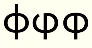
The Greek ‘phi’ is a good example of different design interpretations. Whilst the the far left version is the usual suspect, the middle variant has a calligraphic influence. With the interpretation on the far right we found a design that is just right for the Ubuntu approach – simple, crisp and perfectly balanced with the other characters.
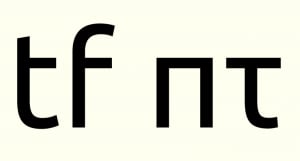
The lowercase ‘pi’ is reduced to its simplest form. In its simplicity it retains its legibility and its construction has a logic that carries across other scripts, too. Other shapes, like ‘tau’, emphasise features. Its terminal follows the movement of ‘iota’ and is closely related to the Latin ‘t’ and ‘f’, and in some way ‘l’. Together with our external consultant we examined every character, and how the interact together, eventually leading us to the final Greek Poytonic character set.


