Scott Mason Nash
on 16 February 2021
For a long time, code in Vanilla was simply set in a monospace font, and we saw an opportunity to improve the way we deliver code examples to users.
A key goal is code clarity – code is not particularly resistant to errors: a missing character (or in some languages, a space or tab) can lead to problems and frustrated users – so the user should be able to select and copy the code easily. Syntax highlighting goes further toward making the code legible and we felt this was important to include via a third-party library.
Many code examples for modern applications and APIs can have different versions of the same snippet, for example for different languages or versions of the API. We wanted to allow for this so users can easily switch between examples from the code snippet itself.
UX research and prototypes
We undertook some research into the user stories surrounding code snippets, including benchmarking other documentation sites and talking to users.
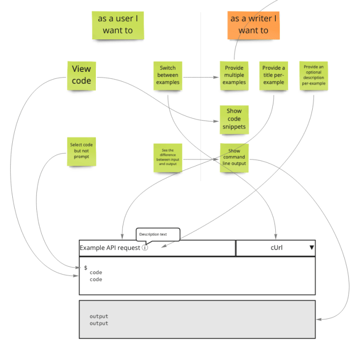
We mapped our user stories to example prototypes and tested them interactively. We wanted to provide a high level of familiarity for users. We were aware that a large number of users land directly on the examples pages from a search results page, so the code snippet needs to be intuitive and easily understood.
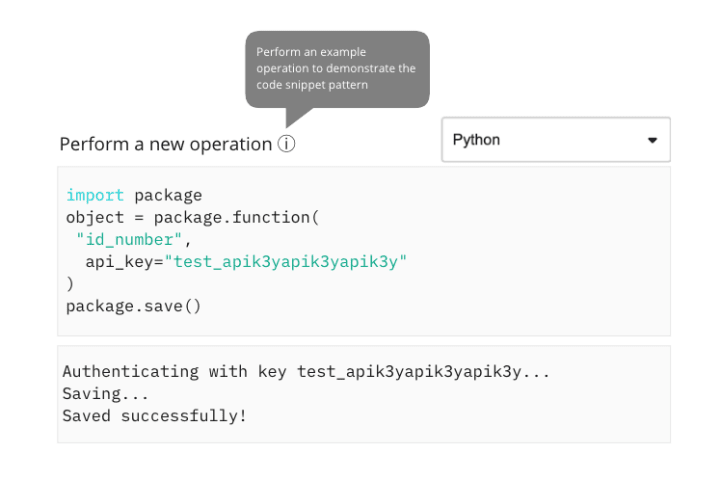
We produced higher fidelity wireframes to test them with internal users before passing the work over to visual design.
Visual design
In terms of visual design, we wanted to achieve two things:
- Decouple the styling of code elements from that of form inputs
- Introduce syntax highlighting
Decouple the styling of code elements from that of form inputs
Before this update, code snippets in Vanilla were styled too closely to text fields / text-areas. For comparison:
The previous design of a single/multiple line code snippet:
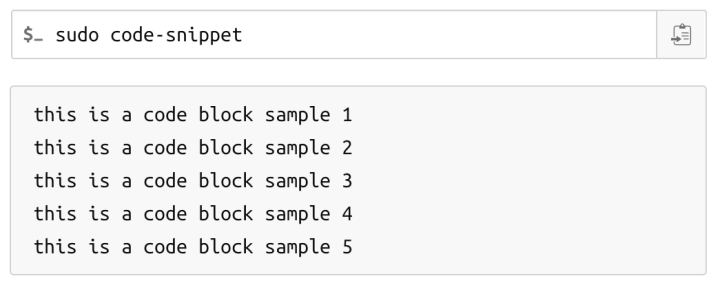
This was misleading, as you cannot type into a code snippet. It is also inconsistent with an inline code snippet:

To remedy this, we derived the new design of the code snippet by making minimal incremental changes to the inline code snippet:
A block-level single line snippet simply adds padding and block-level behaviour:

Specialised use cases like a terminal command or a link add an icon and an indent:

A multiple-line code snippet simply increases the number of rows:

A modular code snippet uses the h5 heading styling as a section title styling on a slightly darker background:

Syntax highlighting
An optional feature we included was syntax highlighting. We decided early on to go with an off-the-shelf solution, eventually settling on Prism.js. None of their themes provide sufficient contrast to meet AA contrast requirements. To fix that, we replaced the original colours with versions that meet those requirements:
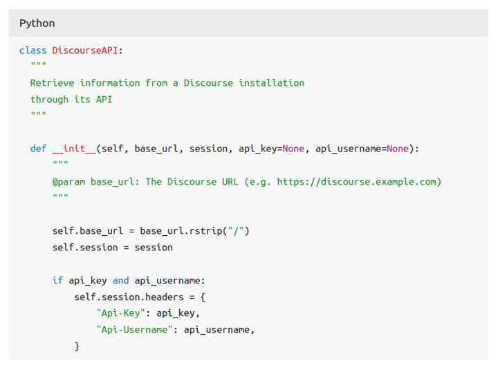
We try to avoid external dependencies wherever possible in Vanilla, so in this instance, the only thing actually added to the framework is a custom CSS theme, with instructions on how to include Prism.js in a given project.
Implementation of the component
The code snippet was designed to ultimately replace Vanilla’s existing code patterns, such as code numbered and code copyable. We made the decision to both deprecate these patterns, and at the same time update them to give them a look consistent with the code snippet, without changing the HTML structure used and breaking existing implementations.
A key feature of the design was the ability to switch between different code examples within a single code snippet instance. Our first thought was to take advantage of the contextual menu pattern already present in Vanilla, but in practice, we found that it wasn’t as suitable as we’d first thought and, in particular, wasn’t accessible. We opted instead for a simple select element, with a small amount of JavaScript to handle toggling between visible code examples.
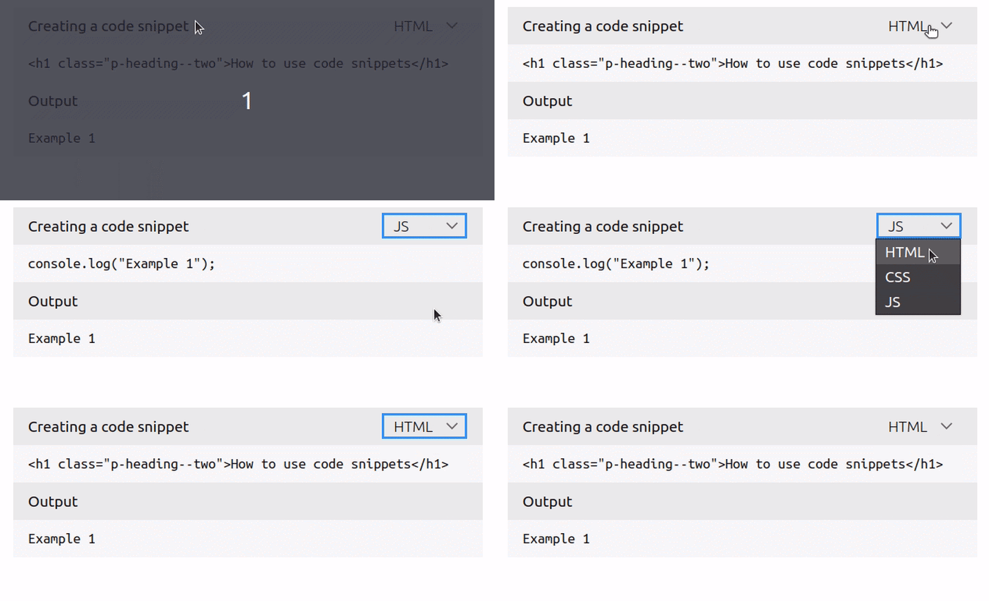
The pattern allows for multiple select elements to be included, either inline with a title or, if the user prefers, below the title using a “.is-stacked” utility class. The behaviour of multiple selects was a point of debate: should each select only determine which example was currently visible? Should one select control the options present in another?

In the end, and for the sake of simplifying the example, we chose not to make any assumptions about how a code snippet with multiple selects should behave, instead of leaving up to the implementation to decide on the solution that best suits their purposes.
In addition to the implementation of the code snippet styling in Vanilla framework, we added a React component for it to our library as well. This allows us to make the new component available for our React applications.

