Canonical
on 11 May 2016
App design guide to go live (bit by bit)
In the coming months we will be rolling out the new app design guidelines, which will give you the latest toolkit best practices and patterns so you can make your own convergent app for Ubuntu.
Why do we need design guidelines?
The guidelines are a big part of communicating design practices and philosophy to the community and the wider audience. Without it, we wouldn’t have consistency in our design language and people who want to develop or design on Ubuntu wouldn’t be able to maintain the identity we so love.
Throughout the guide you will see the rationale behind our design values through the development our Suru visual language and philosophy.
What’s to come?
We are going to start releasing parts of the Building Blocks section first, which contains all the components you need to start building your application.
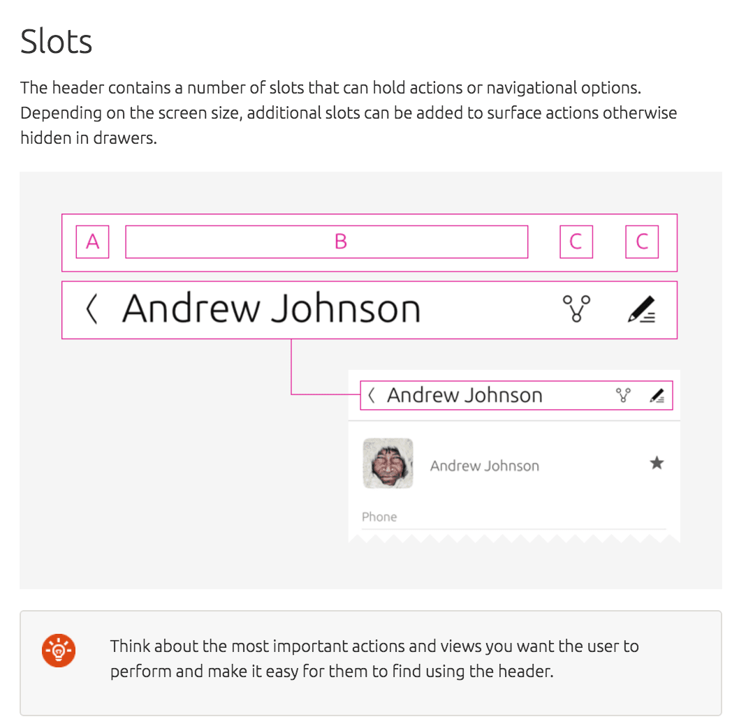
Back in November last year we took a look at defining styles for the guide e.g. how to illustrate examples of best practice. The guide will feature UI examples of how the component will look inside an app across screen sizes, as well as breaking them apart so you can see what goes where and how.
Here’s a sneak peak…
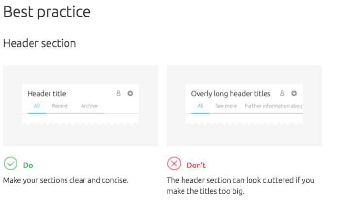
After user testing on the current design guide, users said it was hard to find content as it was lost in the large amounts of text, so we have given the guide a bit of a nip and tuck by balancing visuals and text accordingly.
All new sections
As well as ‘Get Started’, ‘Patterns’ and ‘Building blocks’ we will now introduce: ‘System integration’ and ‘Resources’ to the list, as well as an overview page for each section highlighting key areas.
System integration will feature the number of a touchpoints your app can plug into inside the Ubuntu operating system shell, such as the launcher, notifications and indicators. For example, you can add a count emblem over your app icon inside the Launcher to show unread messages or available updates.
The ‘Resources’ section will feature downloads such as grid layout templates, the new colour palette and our icon set.
Over to you…
We can’t wait to see your app designs and hope that our design practices will help you achieve a great user experience on Ubuntu.