Rae Shambrook
on 18 January 2016
In the coming months, users will start noticing things looking more and more different on Ubuntu. As we gradually roll out our new and improved Suru visual language, you’ll see apps and various other bits of the platform take on a lighter, more clean and cohesive look.
Why refresh apps at all?
As Ubuntu brings convergence to life—embracing today’s as well as future devices—our visual style and UI Toolkit need to evolve to support the new world. The changes taking place platform-wide make it simpler for designers and developers to integrate convergence from inception, and help apps come to life equally on mobile or desktop without a lot of additional work. As we apply new convergence UI and UX patterns to general-purpose components like lists and checkboxes, we also seek out opportunities to work with community developers and designers to put the thinking and new components into practice. The Clock app has been one such opportunity.

The Redesign
Our clean, crisp and lucid Suru visual language and style works well with the added functionality required for convergence. There’s less visual distraction and noise than ever, providing a clear pathway to making the most of the new toolkit’s convergence functionality.
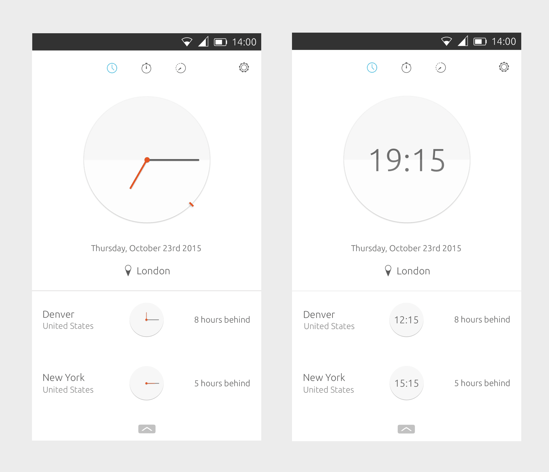
Our Suru visual design language is based on origami, with graphic elements containing meaningful folds and shadows to create the illusion of paper and draw focus to certain areas. Using the main clock face’s current animation (where the clock flips from analog to digital on touch) as inspiration, it seemed natural to place a fold in the middle of the clock. On touch, the clock “folds” from analog to digital.

To further the paper look, drop shadows are used to give the illusion of layers of paper. The shadow under the clock face elevates it from the page, adding a second layer. The drop shadows on the clock hands add yet another layer.
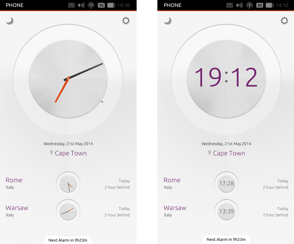
As for colours, the last clock design featured a grey and purple scheme. In our new design, we make use of our very soon-to-be released new color palette. We brightened the interface with a white background and light grey clock face. On the analog clock, the hour and second hands are now Ubuntu orange. With the lighter UI, this subtle use of branding is allowed to stand out more. Also, the purple text is gone in favor of a more readable dark grey.
The bottom edge hint has also been redesigned. The new design is much more minimal, letting users get used to the gesture without interrupting the content too much.
In the stopwatch section, the fold is absent from the clock face since the element is static. We also utilize our new button styling. In keeping with the origami theme, the buttons now have a subtle drop shadow rather than an inward shadow, to again create a more “paper” feel.

This project has been one of my favorites so far. Although it wasn’t a complete redesign (the functionality remains the same) it was fun seeing how the clock would evolve next. Hope you enjoy the new version of the clock, it’s currently in development so look out for it on your phones soon and stay tuned for more visual changes.
Visual Design: Rae Shambrook
UX Design: James Mulholland


