Inayaili de León Persson
on 11 June 2014
This post is part of the series ‘Making ubuntu.com responsive‘.
All our designs are created using the Ubuntu font, and the websites are not exception. Ubuntu.com was already using a carefully refined and tested typographic scale that we have evolved over the years.
Early in the project, we had decided that the large screen view of the website would be kept, so we would be reusing the original styles (with some updates and clean up) and it became the typographic scale for the desktop view.
Adjust as needed
When working on the pilot responsive projects like Ubuntu Insights and canonical.com, we’ve used that original scale and reduced it, keeping the proportions.
After some device testing to adjust paragraph size for comfortable reading, we settled on having the base font size modified at our grid breakpoints to 14px, 15px and 16px.
By keeping the proportions of the sizes though, it was easy to see that some font sizes and margins were too large in proportion to others at small screens — especially the larger headings like h1 —, so we tweaked these as needed to improve readability.
A typographic scale can serve as a guide, but you don’t have to stay married to it: adjusting sizes to what feels better is an important step in making sure your text is comfortable to read at various sizes — and the best way to test this is on the actual devices!
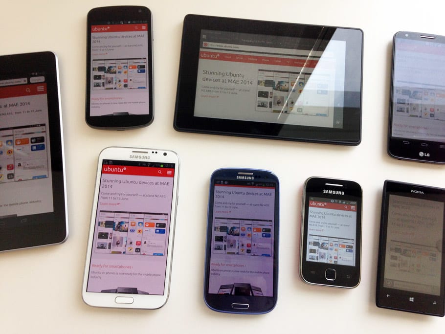 Testing ubuntu.com on various devices.
Use ems
Our typographic scale is defined in pixels, but the sizes are specified in ems in our CSS so they can be scalable.
 Differences in the typographic scale from small to large screens.
Reuse existing patterns
We have a weekly designers meeting where we talk about new patterns we’re working on in our separate projects across the entire design team. This way, we minimise the risk of creating new patterns when existing ones are in place, and when something new is created it can be shared with the rest of the team to use.
So we made sure to show our updated typographic scale and get everyone’s feedback on it, including designers from the apps and platforms teams. The best part was that we had reached similar conclusions about which sizes worked best in small screens (the variation was in the decimals) so we were all being consistent when it came to mobile!
Remember fallback fonts
Even though web fonts are widely supported now, some browsers, like Opera Mini, just don’t support them, so it’s always a good idea to look at your site across various devices and browsers, and turn off the font-face declarations to see if the fallback fonts that you’ve declared look as good as you can make them and match as closely as possible with the original font. By doing this you’ll make the transition between the fallback font and the web font once it’s finally loaded less obvious and less jarring for the user.
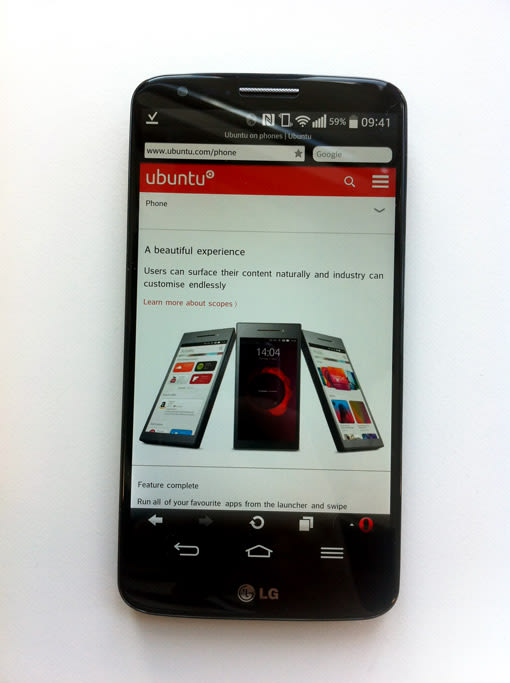 Opera Mini, without the Ubuntu font.
Conclusion
There are a few simple things you can do when transitioning from a fixed-width to a responsive website. The focus should be to improve readability, so it’s vital to check as many pages and screens of your site in different devices. And remember that picking a typographic scale is not as simple as taking numbers out of a generator: you have to see it in action and adapt it to your project.
We’d love to hear how you handled typography in your responsive projects — leave your thoughts in the comments area!
Read the next post in this series: “Making ubuntu.com responsive: our Sass architecture”