

Elvi
on 16 November 2015
After many hours of research, testing and never-ending questions about structure, design, aesthetics and function, we’re very happy to announce that Jujucharms has a new homepage!
All through this site redesign, our main aim has been to make complex content easy to digest and more fun to read. We’ve strived to create a website that not only looks beautiful, but also succeeds in thoroughly explaining what Juju is and the way it can improve your workflow.
Key content is now featured more prominently. We wanted the homepage to be illustrative and functional, hence the positioning of a bold headline and clear call to action which users immediately see as they access the site.
One of the key change between the old homepage and the new is the addition of two visual diagrams, which we have made sure to optimise for whichever device users may be accessing the site with. The first diagram explains the most relevant aspects of the service and how users can incorporate it into their workflow (Fig. 1). The second explains the different elements that compose Juju and the way the service works at a technical level (Fig. 2).
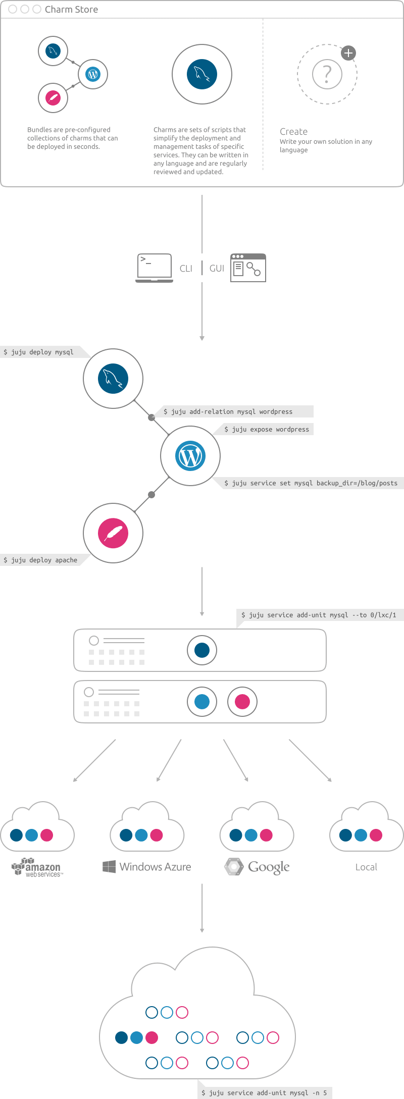 Figure 1.
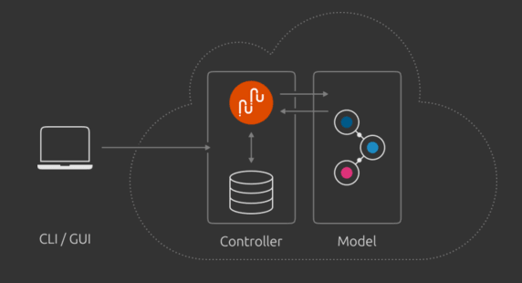 Figure 2.
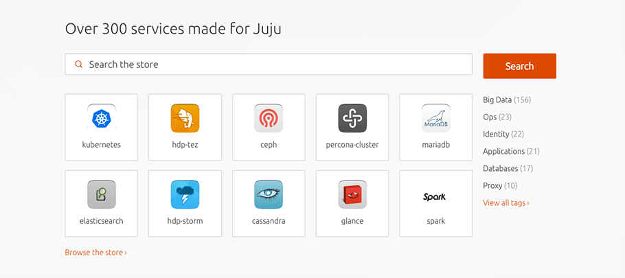
After scrolling, visitors encounter a section which allows direct access into the store, encouraging them to explore the wide range of services it offers. This allows for a more hands-on discovery and understanding of what Juju is – users can either start designing straight away, test it, or explore the site if they wish to find more information before trying it out.
Overall, we’ve made sure to re-design our homepage in a way that truly benefits our audience. In order to do so we conducted numerous user testing sessions throughout the development of the site and re-iterated the designs based on our user’s feedback. This approach enabled us to understand which content and elements should be prioritised and define the best way to evolve the design.
We collaboratively reviewed and analysed our findings as a team throughout the process and made decisions on next steps to take. After quite a few iterations we hope to have designed a homepage which reflects the core concept and benefits of Juju, and that it becomes something that users will want to come back to.
We hope you like it and look forward to hearing your thoughts about it!


