Anthony Dillon
on 28 June 2021
The web team at Canonical run two-week iterations building and maintaining all of Canonical websites, product web interfaces and much more. Here are some of the highlights of our completed work from this iteration.
Web
The Web team develops and maintains most of Canonical’s sites like ubuntu.com, canonical.com, and more.
Sliders
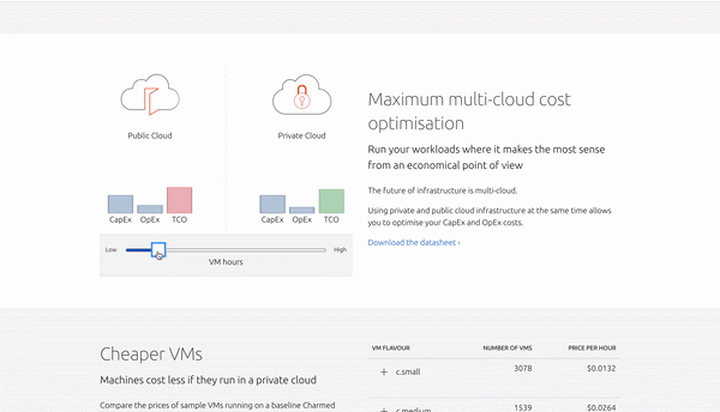
We built a slider for the OpenStack page to show the cost difference between private and public cloud.
New certified site
The old certification.ubuntu.com site has been decommissioned in favor of the new certified hardware site. If you try to access the old site, you will be redirected to the new site.

Brand
The Brand team develop our design strategy and create the look and feel for the company across many touch-points, from web, documents, exhibitions, logos, and video
Snap and Web logos
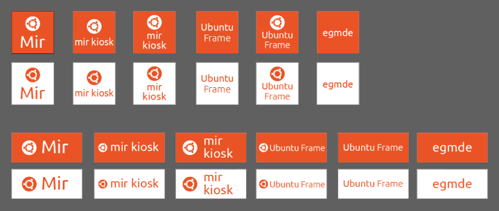
We were tasked with aligning a number of product logos into a cohesive set for use in Snap and web pages by the Product Management team.
Marketing support
There was a range of documents created in this iteration to support the Marketing team, from datasheets to case studies to white papers.

Charmed Openstack vs Red Hat Openstack
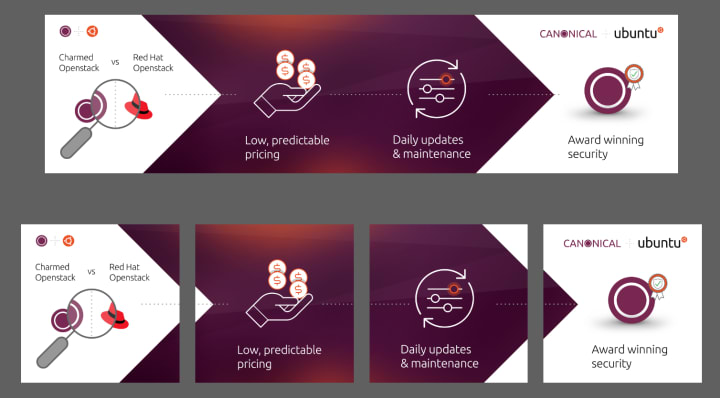
We created a couple of carousel ads comparing the features of Charmed Openstack vs Red Hat Openstack for the Marketing team to run on LinkedIn.

Ubuntu on Microsoft
Over time the consistency of our brand presence on Microsoft had become a bit of a mess. We worked with the WSL team to bring some consistency and order to how we display our logos and downloads to make it easier for users to get the version of Ubuntu they require
Before:

After:
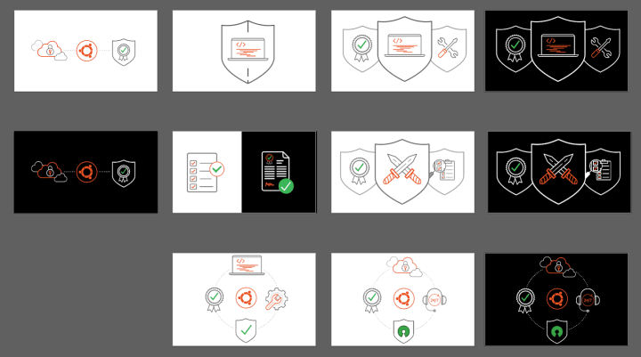
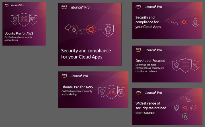
Ubuntu Pro and AWS co-branded banners
We developed some new illustrations and then built over 16 different social banners in various sizes for our co-branded campaign with AWS.
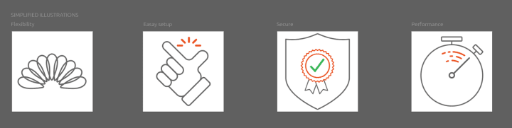
Mir illustrations
In tandem with the updates being made to the Mir website, we were asked to create some new illustrations to be used across the site.

Commercial
The Commercial team maintains and develops all commercial service UI’s provided by Canonical. Including the UA store.
Redesign of the Ubuntu Advantage User Interface
In this iteration, the UX team has been working on a full redesign of the Advantage interface for signed-in users.
We know the current UI at /advantage causes problems for some users and doesn’t expose all the functionality of users’ UA subscriptions in an obvious and usable way.
Some of the issues we identified from user interviews and metrics are:
- It’s hard for users to find the right token to attach machines
- Users sometimes use their personal token by mistake, instead of their paid UA subscription
- Documentation is spread out into multiple places
- There’s no clear route to get support or open a case
- Users may have purchased subscriptions “offline” through telephone sales, but still, need to manage them online
The next phase of work is a visual design where we’ll refine the designs further and ensure the look and feel of the interface is consistent with the Vanilla Framework.
Apps
The Apps team develops the UI for the MAAS project and the JAAS dashboard for the Juju project.
Information Architecture and the new MAAS layout
In this two-week iteration, we ran a design sprint to quickly prototype the new MAAS layout design. In the previous release, we created an experiment to figure out three different Information Architecture possibilities and we selected the one that makes the most sense to test out the new MAAS layout.
Because we had a very limited amount of time to work on this project, we scoped our work to test out three main components in the UI; the new MAAS Information Architecture, the action bundle, and the bottom status bar. We did a rapid prototyping style of user-testing with six MAAS users from different environment categories. While testing out this prototype, we focus on three aspects of the design; learnability, efficiency, and error-tolerant.


The design above went through several iterations of redesigning during the testing phase and here are our findings.
- Navigation: A few people find the concept of spaces out of place in the navigation, because they feel that it belongs in the Networking tab and its functionality was not used as frequently.
- Quick-access machine listing column: Five out of six people were really excited that there is an ability to switch between different machines to view its details because we’ve discovered that many users had to open up several tabs for two reasons; 1. They are trying to compare configurations between different machines, 2. In a huge MAAS environment, it can take longer to load the entire list of machines.
- Bottom status bar: In our earlier prototype, we found that we were trying to fit two purposes in one concept by adding both local and global statuses in this area and the white background colour made this bar out of sight, so a lot of information that we surfaced was not getting enough attention. As a result, we decided to only include global statuses in this area and changed the background colour to make it stand out.
- Action bundle: In the previous MAAS design, we realised that the `Take Action` button is too far from the interaction point and there are too many actions inside the dropdown, so the complexity score is quite high. So in this prototype, we broke down the take action button by the most popular action and moved it closer to the interaction point. We hope to make it more contextual by showing the right action for different machine statuses.
Our next step after we finalise these three components is to focus on how we can tailor the advanced search and filtering functionalities to match with how people work as well as templating machine profiles and notification center.

MAAS React migration sprint
Continuing from last week’s planning work to migrate MAAS to React more quickly, we’ve joined forces with other web-team members to quickly turn the Angular legacy pages to React.
In this sprint, we did a pair programming style sprint, where we on-board the web-team members with MAAS architecture and how the API works. Then we split tasks into different components and pages for each pair. So far we’ve made really good progress in the UI where the Availability Zones page is now in React.
The next step for this migration is to summarise our work task, clean up, and refactor code in a few places before we ship it.
Vanilla
The Vanilla team designs and maintains the Canonical design system and Vanilla framework library. They ensure a consistent style throughout web assets.
Navigation explorations
Our Brand team is working on new logos as part of a major rebranding effort. We collaborated with them to explore how the new logos and Brand direction might affect existing navigation components and headers on our sites.

Moving our design system to Figma
We’re in the process of migrating our design library from Sketch to Figma. In this iteration we did a product feature spike in MAAS, relying solely on Figma, and in the process, we recreated a few of our heading styles and components in Figma.
One of the pleasant surprises at this early stage was the ability to exactly replicate padding and margins by turning headings into components. This has the potential of completely eliminating white space guesswork when creating mockups:


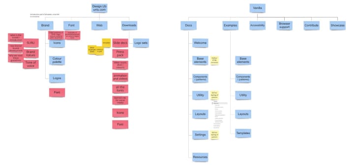
UX research on new Design System site
We aim to design a new Canonical Design System site that incorporates brand assets, design and development work, and guidance in one place
We first break down the current 2 sites’ Information Architecture, to understand the project scope and identify the content we are missing.
Then some competitor research on the design system is done to get inspirations on how they align key components on their site structure, across different sizes and usages of the design system.
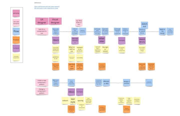
We also analysed different personas’ use cases and needs at each stage of using the design system.
Marketplace
The Marketplace team works closely with the Store team to develop and maintain the Snap Store site and the upcoming Charmhub site.
Brand Store Migration
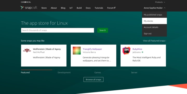
In the process to migrate functionalities from the Dashboard to snapcraft.io, we worked on the information architecture to access the brand store page
We have now the pages available when you have admin right:
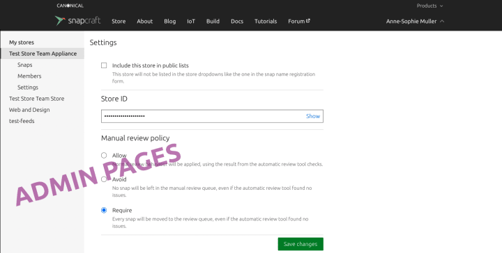

As well as when you are a viewer only of a store
With a pattern of searching in the left navigation panel when having a long list of stores:

To be aligned with the same pattern on other tools (like in the coming MaaS)
Brand Store – Admin Snaps
In this iteration we have improved the readability of the side navigation, particularly on smaller breakpoints such as tablet and mobile, as well as tidied up the table area. The “Release date” has been moved into its own column where previously it was below the “Latest release” which created a double column. With every row being on a single line we are able to show more rows in a single view.
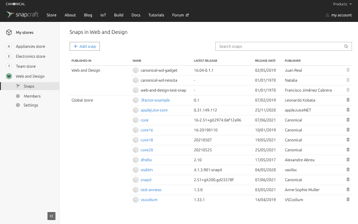
Store names are user-defined. The idea is to take the first character of a store name and represent it in a circular icon, so when the side navigation is in a collapsed state it would be easier to identify where and which store you are looking at; especially on a tablet


Team posts
We are hiring
- Home based – EMEA
Senior User Researcher ›
The design team at Canonical is looking for a Senior User Researcher, expert in current research practice, with interests in technology and innovation. - Home based – EMEA
UX Designer ›
Join the team that designs and builds our enterprise web-applications, for cloud services, IoT and the data-centre. User experience at Canonical is a collaboration between front-end engineering, product management and visual design. - Home based – EMEA
Web Developer ›
An exceptional opportunity for a web developer to work within a large team of UX and visual designers and developers building websites and apps.
With ♥ from Canonical web team.