

Canonical
on 16 January 2013
With the recent reveal of Ubuntu on phones, and now the release of an example “Notes” application and toolkit , we thought this would be a great opportunity to share a summary of the process we went through for the design of the application itself.
Why it is needed
There has been a lot of research carried out for the effort of bringing Ubuntu onto the phone, from which a number of insights emerged. Of particular interest to us was the user’s mobile shopping habits; not only were they “on the go”, but “shopped tactically”- capturing specifics, comparisons and scrapping information as they browsed the internet and other applications. These habits inspired the Notes application.
The brief (in brief)
The brief we set ourselves was tight, constrained by time and the practicalities of the functionality in the first release. We had a week to go from design to development of an application that demonstrated and utilised something from our toolkit, was useful in the context of the Ubuntu experience and fitted with our brand. From analysis of this shopping behaviour and from competitor analysis, we identified three key user scenarios:
- Add
- Edit
- Delete a note
Sketching and brainstorming
Having familiarised ourselves with the research, designers and developers jumped into sketching and brainstorming alternative concepts based on their insights.
Outcomes of these workshops included:
- High level goals for the app
- Mental models
- Storyboards
- Interaction and visual patterns
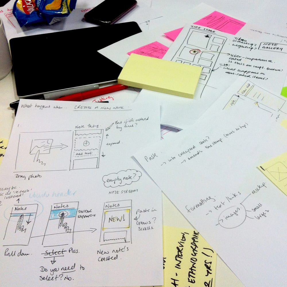
Exploring the best ideas
Our exploration ranged from finding out what a “digital post it note” really is, to the mental model of a scrapbook and how that may differ to that of a sketchbook, to a stream of consciousness similar to the timeline of a social network.
After talking through the different storyboards and mental models from this phase with developers, visual, user experience designers, we decided on 3 main concepts that showed most potential in meeting the user’s needs:
- A note gallery where the user can organise and arrange the notes to be presented in a hierarchy
- A single note ‘strip’ where there is no sense of an individual “note”, only updates to a timeline
- A stream/feed where a list of notes are viewed in an index, ordered chronologically by time of last edit
We explored these further by sketching specific activities in detail.
Something we’d have loved to do at this stage would have been to put some of these sketches in front of some users to gain feedback on the alternatives. Without time to test beyond our team and the guys in the office, we discussed more with our developer, looked back to our research and concluded on the direction that felt most in tune with our goals. The patterns we have used for navigation of content elsewhere on the phone provided the building blocks to properly realise our concept beyond the pen and paper.
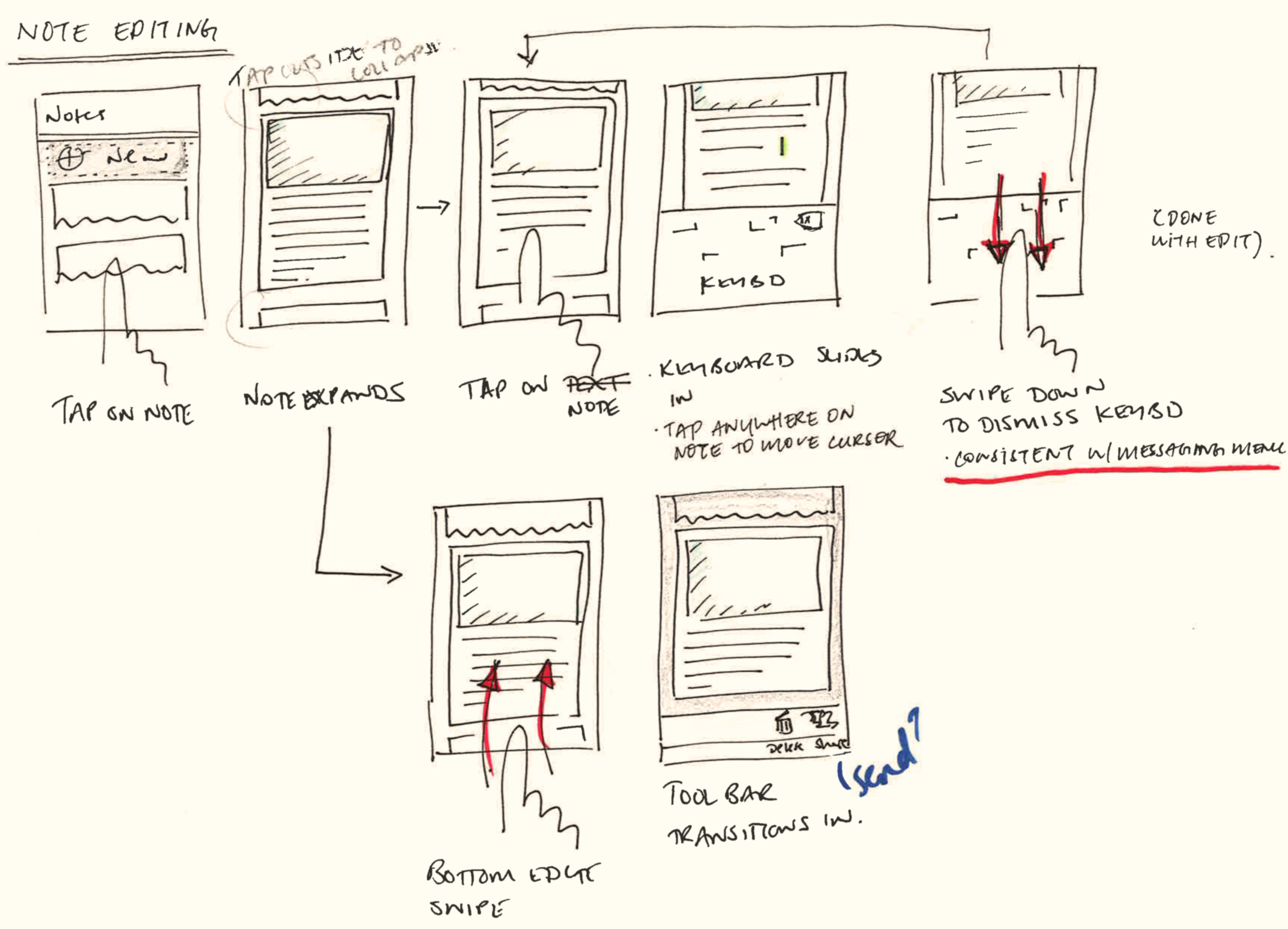
Detailed design
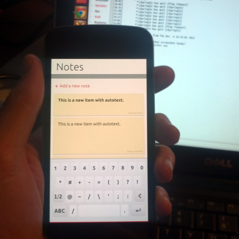
We worked with our developer to quickly iterate transitions, behaviours and, while working similarly with visual design to keep the application on brand, came to the end result you see now.
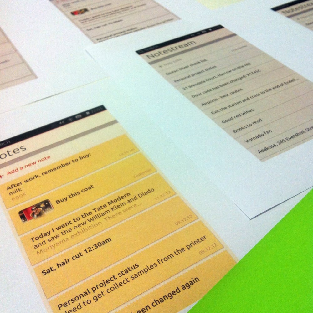
The work is not done! This first release will generate user feedback; be it from usability testing or use ‘in the wild’; which will inform the next development of the application – Have a play around, now the fun really starts!


