Canonical
on 23 June 2011
Kashmiri Arabic script – questions, questions…
We are in the final stages of completing the Ubuntu font suite. Unhinted monospace fonts were revealed at UDS in Budapest and seem to have gone down quite well from what I can gather. We currently furiously hinting the fonts to make sure that their appearance on screen is meeting expectations.
We are now putting the two complex scripts Hebrew and Arabic together. Although the basic design of the Arabic was finalised some months ago we have been doing a lot of background work investigating language support, and thus defining a glyph set. This work has led us to have aprox. another 1,000 glyphs in the font supporting languages such as Kashmiri. Our designer Jonathan Pierini currently has the task (some would say unfortunate) of compiling the various glyphs and their diacritics. Whilst doing this we have come across a few situations which we hope someone from the Ubuntu community can help us with.
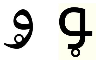
In Kashmiri the glyph ‘waw with ring’ is used. In the Naskh, Nasdaliq and similar scripts the tail of the ‘waw’ often stretches out downwards which gives the designer the opportunity to attach the ring to the tail on the inside of the character. However, Kufic style fonts like Ubuntu tend to have a more closed ‘waw’ tail shape making it difficult to place the ring on the inside of the character. We have now created a versions that has the ring on the outside of the glyph but are uncertain if that creates a legibility issue. I am of course aware that experience of Latin design cannot be directly transferred to non-Latin design but looking at the Danish a-ring for example, I know that there is some room for interpretation. Normally, the ring is placed above the lowercase glyph, as a separate element to the ‘a’. But where space is tight the ring can be part of the ‘a’ as long as a ring shape is visible and the character can be correctly identified.
A Naskh style ‘wawring’ on the left, Ubuntu ‘wawring’ on the right
Kashmiri (and possibly other languages) also use a wavy hamza. Again, we’re uncertain if this is a distinctly different character to the Arabic hamza or is it a stylistic variation that is script dependent meaning that a standard hamza is acceptable.
We would love to hear from you on this as these are very detailed questions yet there is little information to be found. We want to make sure we can provide as comprehensive and high quality a font suite as we possibly can within the limits of our current remit.
Bruno Maag


