

Luca Paulina
on 28 June 2016
Juju is a cloud orchestration tool which enables users to build models to run applications. You can just as easily use it to deploy a simple WordPress blog or a complex big data platform. Juju is a command line tool but also has a graphical user interface (GUI) where users can choose services from a store, assemble them visually in the GUI, build relations and configure them with the service inspector.
Juju GUI allows users to
- Add charms and bundles from the charm store
- Configure services
- Deploy applications to a cloud of their choice
- Manage charm settings
- Monitor model health
Over the last year we’ve been working on a redesign of the Juju GUI. This redesign project focused on improving four key areas, which also acted as our guiding design principles.
1. Improve the functionality of the core features of the GUI
- Organised similar areas of the core navigation to create a better UI model.
- Reduced the visual noise of the canvas and the inspector to help users navigate complex models.
- Introduced a better flow between the store and the canvas to aid adding services without losing context.


Empty state of the canvas

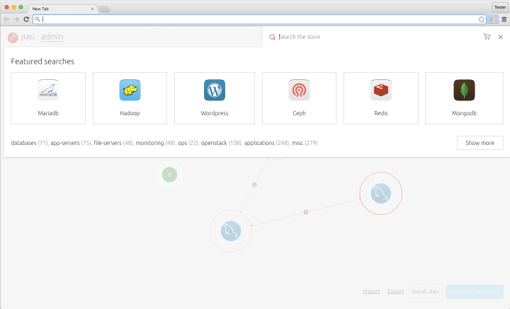
Integrated store

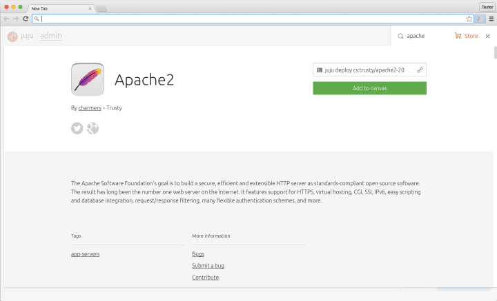
Apache charm details
2. Reduce cognitive load and pace the user
- Reduced the amount of interaction patterns to minimise the amount of visual translation.
- Added animation to core features to inform users of the navigation model in an effort to build a stronger concept of home.
- Created a symbiotic relationship between the canvas and the inspector to help navigation of complex models.


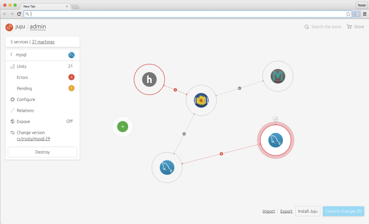
Mediawiki deployment
3. Provide an at-a-glance understanding of model health
- Prioritised the hierarchy of status so users are always aware of the most pressing issues and can discern which part of the application is effected.
- Easier navigation to units with a negative status to aid the user in triaging issues.
- Used the same visual patterns throughout the web app so users can spot problematic issues.

Mediawiki deployment with errors
4. Surface functions and facilitate task-driven navigation
- Established a new hierarchy based on key tasks to create a more familiar navigation model.
- Redesigned the inspector from the ground up to increase discoverability of inspector led functions.
- Simplified the visual language and interaction patterns to help users navigate at-a-glance and with speed to triage errors, configure or scale out.
- Surfaced relevant actions at the right time to avoid cluttering the UI.


Inspector home view


Inspector errors view


Inspector config view
The project has been amazing, we’re really happy to see that it’s launched and are already planning the next updates.


