

Canonical
on 20 July 2009
I thought I’d share a fun paper cut from this week’s milestone that has seen some interesting developments. The proposed changes (and discussion) have grown larger than paper cut size, but some progress was made (resulting in a PPA for you to try) and you may find the work fascinating like I do. The paper cut in question is “Nautilus file browser toolbar is complicated, needs a face-lift”. Check the bug report for the description, which I will summarise here.
Basically, the default arrangement of Nautilus (in Ubuntu 9.04) presents the user with a huge amount of complexity and uses screen space incredibly inefficiently:

I asked myself a few questions while looking at the default file browser:
- Back, forward, up, stop, reload, home, zoom, a location bar — these are the same controls available in my web browser that I know and love. Why do they look so different here? They take up so much more space, and they occupy two toolbars where my web browser needs only one.
- “What does the Stop button do?”
- Why do back, forward, up, stop, etc. have text labels? They don’t have text labels in Firefox. The icons are good — I recognize the symbols and understand what the buttons do.
- Why do I have “Home” and “Computer” buttons when the same functionality is available and made much more useful in the side pane? That seems redundant.
Andreas Nilsson demonstrates that Nautilus dedicates more real estate to chrome than content, and provides some insightful comments:
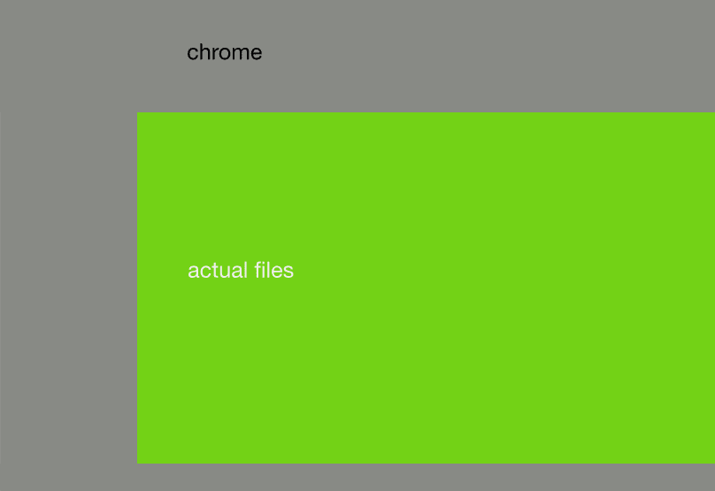
Here is a comparison between the size of the chrome (gray) and the area where you see the actual files (green) in the default nautilus window size on a new (guest) account. This does not take into account tabs or the bar that appears when you’re about copy files to a writable cd. Solving this bug would mean more space for the green area.
With my icon designer hat on, icons such as Visualization in Rhythmbox benefit from a label, as it’s a much less common symbol in our everyday lives than arrows (that are practically everywhere), so I don’t believe dropping the labels from those icons will impact notably on the learnability of the interface.
Marcus Carlson wrote a patch, and now we have a working simplified Nautilus. The Stop and Reload buttons have been combined, labels and the location toolbar have been turned off, the location bar was moved to the navigation pane, the location bar toggle was removed (use Control-L to access it), separators were removed, the up arrow was removed, and the computer icon was removed. Here is a screenshot from my laptop:

I am using gnome-globalmenu, 9pt fonts, Humanity icon theme, and Murrina Candido with an emerald window decoration in the screenshot above, which makes it more difficult to compare with the screenshot of a default Nautilus window, but hopefully you can still appreciate the changes.
You can find this patched version of Nautilus in Marcus’s PPA. These changes were rejected upstream for a couple of good reasons, and because Nautilus developers would prefer a solution that allows the toolbar to be easily customised at runtime (which was requested in a bug in 2000). Marcus is also working on the toolbar editor.


