bethcollins
on 17 March 2022
The Vanilla squad recently spent a two week sprint prototyping an interactive live demo box. We were tasked with coming up with a proof of concept, to enable demoing of each variant of our examples dynamically. A few guest developers were able to joined us, which meant four of us were able to dedicate a two week iteration to the project.
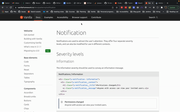
How it currently works
Currently, each Vanilla component has its own docs page, and each variation of that component lives under its own heading. Some JavaScript works its magic, by grabbing the correct corresponding HTML example file and injecting it under the heading. Et voilà:
Although the current structure works well, the component docs pages can be lengthy with a lot of text and scrolling. We wanted to investigate a different method… In comes the live demo box!
How we want it to work
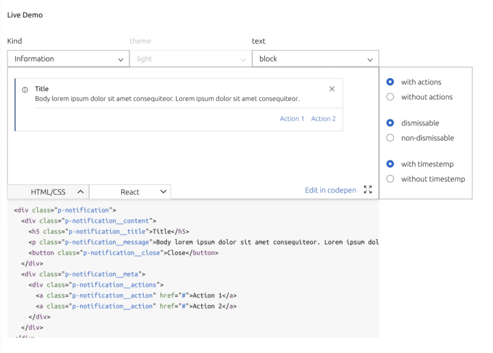
Instead of showing each example one after the other, we want one interactive live demo box per variant.
We distinguish between variants by defining the use case. If the use case is the same, it comes under the same variant. If it’s different, it comes under a new variant. The following features were requested:
- Drop down options to change the type, theme or style
- Radio buttons or a switch to turn on or off modifications
- A viewing window to display the correct combination of features of the component
- The correct variation of code presented underneath the viewing window
- On change of the inputs, the example in the window and the code should dynamically update to show the correct example
Nice to have:
- A link to open Codepen and inject the correct code
- A full-screen button to open the example in another window full screen
- Scalable code which can be used for multiple components, not only specific to notifications
Initial planning
We started with an initial kick-off meeting where the problem was presented. The Zeplin file was shared from our design team with a guide to how the demo should look.
We decided, as it’s a reusable component which updates after an interaction by the user, React would work really well for this. First, we had some questions which needed some thinking about and planning:
- How would we provide the data for the options for the drop downs, for example the kind of notification, the type of text in the content etc?
A JSON file could be a good option for this. Where we currently have only the notification.html file, we could also have a notification.json file containing all the features and variations of each example, to populate the demo box options.
- How would the notification.html example page know which variation of the example to render?
We thought passing parameters in the url could work well, as the file supports Jinja template rendering. The example HTML code could then have conditional rendering depending on the query parameters.
- Is it possible to make one demo box work for every component variant?
This was the million dollar question. We weren’t really sure at this point, as each component is so different. Would we be able to have one UI structure which works for everything? I guess we will find out!
Implementation
Firstly, we added a json file containing the configuration values to populate the demo box for the notification pattern. The structure includes human readable values for the labels, and query values to append to the url.
We then edited the template to include conditional rendering, so the flow looks a little like this:
- The user selects an option from the demo box
- The value of that option is then appended to the url
- The example template file reads the values of the query parameters
- Depending on that value, a different version of the example is rendered
Here is the entire toast.html file if you’re interested in seeing how the file is structured.
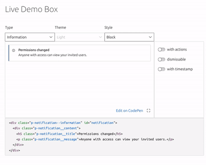
Min and I worked on building the React component. It was fun building something from scratch, and we were able to spend most of our time pairing. After a few TypeScript battles (we’ve all been there), we were able to construct something which resembled the Zeplin design we were given.
Conditionally rendering the code
We also needed to include the necessary code for each variation. For this we needed to build a React component that fetched the correct code based on the user-defined settings, and then display it. As with the rendered component view, we were able to pass query parameters based on the user-defined settings when fetching the code. Thanks to the magic of Jinja’s conditional rendering capabilities, our frontend component was able to simply request a URL and get back the complete HTML, JavaScript and any additional CSS.
Refactoring
Perfect, we had the notification component working – job done! Unfortunately not. We then had to make the React component less specific, to be able to accept a json file of any structure. We used the code snippet component as our next example.
It was then when we realised that it wasn’t going to be as straightforward as we had initially thought. The code snippet component is very different to the notification pattern. There were different combinations of class names and variations which worked either exclusively or alongside others. But, we got there in the end. We finally found a json structure for the code snippet component, and a refactored code snippet template which worked with our refactored demo box code – hooray!
Retro
We had a retro after the sprint to get some feedback from the developers working on the component to see how the process went.
The feedback was mainly positive, which was excellent to hear. The developers enjoyed pairing, working on something different, being able to build something from scratch and at the end of the two weeks being able to demo a working demo box to the rest of the team. Result! We even managed to include some “nice to have”s.
Our feedback included comments that pairing can be tiring especially without frequent breaks. One developer felt that the pairing could have been more structured. An action came from this, to try and ensure the next sprint has more formal dedicated pairing and focus times.
We had some concerns about how scalable this UI will be. After working on the code snippet component and realising the complexity of structuring the json, . We have raised this with our UX team and are currently working on a spreadsheet which will categorise each feature before the interactive live demo box is rolled out.
Conclusion
All in all the sprint was a success. We have a functioning proof of concept which can be used to make the final design decisions, and most importantly we learnt a lot and exposed potential future blockers.