Canonical
on 13 August 2010
Finding the Ubuntu font design
In our second post from Dalton Maag we get an insight into the origin of our very own Ubuntu font. Over to you, Lukas.
Finding the Ubuntu font design
In late 2009 we were first approached by the Canonical design team to work on the Ubuntu and Canonical logotypes which could develop into a display font. However, soon it became clear that this would grow into a much larger project. So in January this year we made a start to create the Ubuntu font – and the main requirement was that it had to do everything, to be a true all rounder. Most importantly, it had to work as the interface font for the new Ubuntu GUI,making functionality and legibility the crucial objective. In addition, the font design needed to be distinctive and recognisable and have some character, because of it’s usage in the Ubuntu and Canonical logos, and other graphic collateral that communicates the product. To be truly useful we aimed to give as big a characterset as possible, defining five different script systems that cover nearly half the world’s population. As you can see, to combine all these features would be hard work. But what a great challenge!
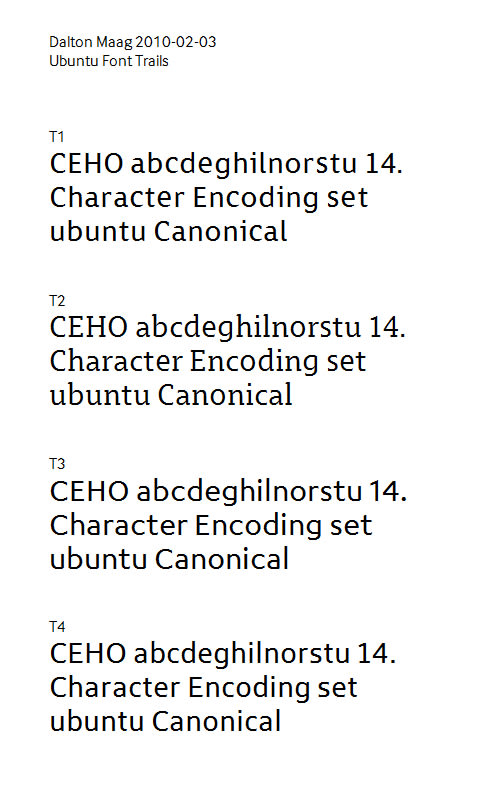
So how do you start such a project? First we had to define the basic parameters for style and function. We created a number of designs and discussed four very different approaches.
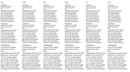
From the start we tested in small sizes on screen. It was very important to define the ideal weight and proportions right at the beginning.
The serif design was quickly dismissed; it didn’t seem to fit into the aesthetics of the overall graphic language. Between ourselves and the Canonical team we chose version T3 from the remaining three designs as a basis for further development.
As we were getting into the details of design some more questions arose. Should it be that wide? Does it work that way? Maybe a bit narrower? Too much? Vertical terminals? Left crossbar on the t and f? Are we going too far? Spur-less u? Spur-less n? What!? How does it effect legibility? Rounded tops? Straight diagonals? Curved diagonals? What challenges does it create? Open shapes? Closed shapes? Did we run out of Coffee?! …
Together with the Canonical Design team we found the right answers. We had got the basic concept, now the real work began.
Lukas Paltram


