Matthew Paul Thomas
on 6 May 2010
Last week Mark Shuttleworth announced that Ubuntu Netbook Edition will have a global menu bar — a single menu bar at the top of the screen, instead of separate menu bars inside each window. This seems like a pretty simple change. But like many design changes, it’s more complex than it appears. And we’ll need lots of help in making it awesome.
Why we’re doing this
For 30 years or so, computer programs have often used a hierarchy of menus to provide access to lesser-used functions — functions that aren’t displayed directly in the interface as buttons, checkboxes, and so on. Because of its information density, a menu hierarchy also serves as a quick map of what functions are available in a program, regardless of how frequently they’re used.
There are at least half a dozen approaches to presenting a menu hierarchy on-screen:
-
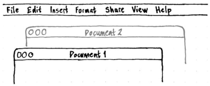
A menu bar at the top of the screen. This was the most common early presentation, used in the Lisa, Macintosh, Amiga, and TOS. It has several benefits, most importantly being quick to use because of the large virtual target area, and saving space through showing only one menu bar at a time. Its main disadvantage is that you need to focus a window before using its menus (particularly an issue if you use focus-follows-mouse). In some themes, it is also difficult to tell which window the menu bar applies to.
-
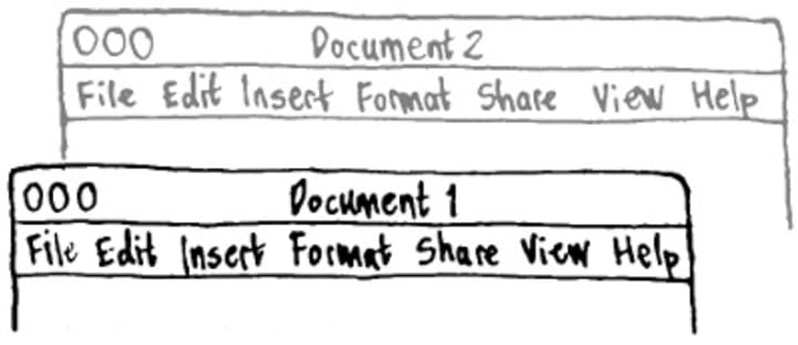
A menu bar at the top of the window. This approach was popularized by Windows, and is currently copied by Gnome and KDE. Its main advantage is that it is obvious which menus belong to which window. Its main disadvantage is that it is slow to use.
-
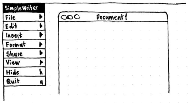
A menu panel at the side of the screen. This was used in Nextstep, and has been continued in Gnustep. It has a speed benefit from the virtual target area off whichever side of the screen the panel is touching, but much less so than a menu bar along the top of the screen (since the target area is based on the title’s height rather than its width). The menu panel can also be dragged close to where you are working, but that movement itself takes time.
-
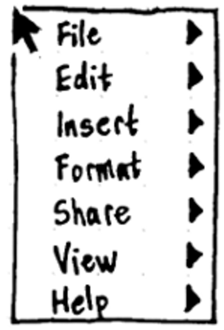
A hierarchical menu on secondary click. Gimp and XChat both do this, though both are just duplicating their horizontal main menu bar. This approach provides quick access to the top-level menus, but that’s outweighed by the unpredictable placement of context menus, compounded by the two or often three levels of hierarchy.
-
Nested pie menus. These are used in several games, and in the Songza Web site. They’re typically invoked by a secondary click, where menus fan out from the cursor position. With simple, icon-based menus the pie arrangement is rapid to use, because menu selection gestures can be learned and repeated. With more complex menus, though, it quickly becomes unworkable to present the text of pie menu items in a compact and readable way.
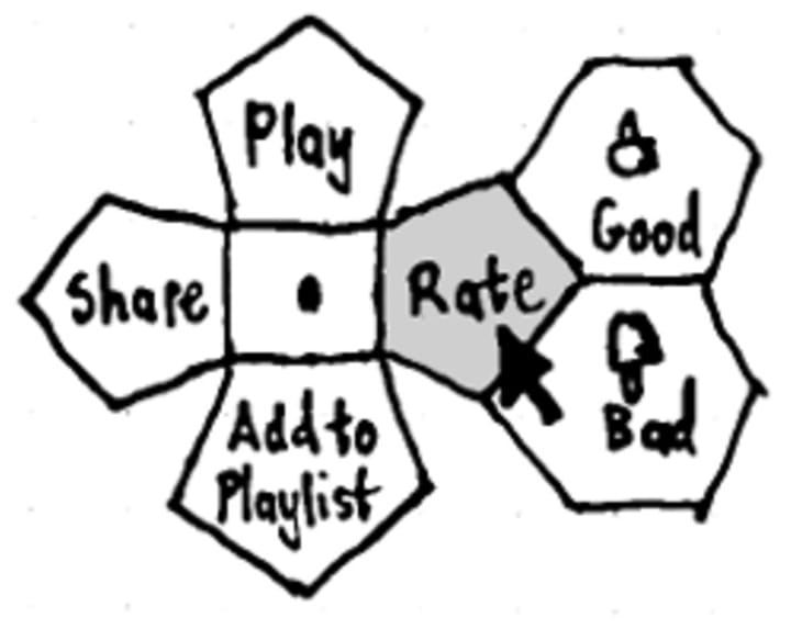
A pie menu based on the one used in Songza. -
No menu bar at all. Microsoft Office, Internet Explorer, Google Chrome (except on the Mac), and Chrome OS have gone in this direction. It saves the most space, and has the advantage that an individual application can list its functions in a way that best suits its feature set. The disadvantage is that for an application of any complexity, trying to avoid a menu bar just litters pulldown menus throughout the interface, and inconsistency makes the overall mental model more complex. For example, in Microsoft Word 2003, Microsoft Publisher 2003, and Microsoft Internet Explorer 6, the “Find” command was in the same menu in all three applications. But in Microsoft Word 2007, Microsoft Publisher 2007, and Internet Explorer 7 and 8, that same command is in three different menus.
Of these approaches to menus, which is best depends on the device. For example, a gaming console might use pie menus for most commands. And a well-designed touch-screen interface would have no menu bar at all (as both Apple and Microsoft have demonstrated).
But on a netbook, space is at a premium, people use feature-packed applications, and pointing is done with a touchpad or mouse. So it’s pretty clear to us that a single menu bar at the top of the screen is the right choice.
The problem of toolkit proliferation
We face several challenges in implementing the unified menu bar. The biggest of these is toolkit proliferation — the wide variety of toolkits application developers have used in writing applications that run on Ubuntu.
On Windows, there is one prominent toolkit, creatively named the Windows User Interface library. Microsoft and other application developers often use custom controls, but in general, when a new version of Windows comes out with a new theme, most applications inherit the new appearance automatically. The developers of applications that don’t use native controls — such as Firefox and OpenOffice.org — bear the responsibility of keeping up with new Windows versions, or pay the price for looking strange.
On Mac OS X, there are two widely-used toolkits, Cocoa and Carbon, and Apple tries to make them look and behave identically. So when Apple makes a change to the toolkit design — like tweaking the way selection works, or making menus searchable — they can make that change in two places, and it applies automatically to nearly all Mac OS X applications past and future. Again, developers of applications that don’t use native controls — such as Firefox and Skype — have to keep up.
With Ubuntu, we’re at a disadvantage, because we have four prominent toolkits . Prominent in that they’re used by applications that Ubuntu installs by default, or that people often install afterwards. There’s GTK, as used by the Gnome environment and many other applications. XUL, as used by Firefox, Thunderbird, and a few others. VCL, as used by OpenOffice.org. And Qt, as used by KDE applications like Amarok. And those are just the common toolkits!
This mixture has made life difficult for us whenever we’ve tried to implement a consistent Ubuntu theme. But it also means that if we want to do anything cool at the toolkit level, we have to get it implemented four times over — in GTK, in XUL, in VCL, and in Qt.
For the menu bar, Canonical’s Desktop Experience team will be working to ensure it works with GTK and Qt applications. And we’ll be looking for help to make it work with XUL and OpenOffice.org applications. Mozilla and OpenOffice.org applications already use the native menu bar when running on Mac OS X, so it should be possible to adapt some of that code.
Tackling the corner cases
Besides having to implement some of the menu bar several times, there are other tricky issues we need to deal with.
Many windows currently don’t have menus: for example, Open and Save dialogs. For these, we’ll introduce a fallback set of minimal menus so that the menu bar doesn’t look weirdly empty when those windows are focused.
Some windows that don’t have menus would do so, if they knew those menus were going to be presented in a separate menu bar: for example, Chromium browser windows should use the same set of menus on Ubuntu Netbook Edition as they do on Mac OS X. For these, we’ll introduce an API so a program can tell whether a separate menu bar is being used.
Some windows have a “Full Screen” command that expects to hide the panel while still showing its in-window menu bar: for example, Inkscape and Gimp. For these, we need to work out a standard full-screen mechanism that retains access to the menus.
And so that it is obvious which window’s menus are being shown, the Ambiance and Radiance themes will need to do a much better job of distinguishing between focused and unfocused windows.
Most of these issues are covered in our specification for the menu bar. We invite you to review it and post your comments, here or on the Ayatana mailing list.
How you can help
To make the Ubuntu menu bar work well, we’ll need to do lots of testing.
First, we need to check that the menu bar is presenting menus accurately — the right text, the right icons, the right keyboard equivalents, the right sensitive/insensitive states. For this, we’ll provide a way to display menus in the window’s menu bar and in the Ubuntu menu bar simultaneously, so you can compare them.
Next, we need to check that the window is laid out correctly once the menu bar is removed. If a window embeds another control into — or next to — its menu bar, that program may need tweaking. Unlike the notification area transition, though, we shouldn’t need to make many changes. Most applications will just work.
So you can help with this testing, we’ll provide a way for people to install the Ubuntu menu bar on standard Ubuntu, not just on the Netbook Edition. We’ll post here later with advice on how to get involved.
Accept no imitations
Finally, there’s been a bit of eye-rolling lately about how Canonical’s Design team seems to be pushing Ubuntu towards imitating Mac OS X. First the purple background picture, then the window title bar buttons, and now the global menu bar. Whatever next? So, a few words about that.
There are some parts of Ubuntu that are, probably, too much like the Mac. For example, the flow of the login screen is very similar to the Mac equivalent, and could be a bit more efficient. On the other hand, there are other parts of Ubuntu that are probably too much like Windows. For example, many settings windows have two close buttons, like they do in Windows; it would be more sensible if they had just one. As with the title bar buttons, these design details did not originate with Canonical’s Design team; they came from elsewhere. But the purple desktop background? Yep, we’ll take the blame for that one.
Our goal is not to make Ubuntu imitate any other OS; our goal is to make it better than any other OS. As we continue to improve Ubuntu, it will become more like Windows in some respects, and less in others. More like Mac OS X in some ways, less in others. More innovative in some ways, and less in others. We’ll try always to do something not just because others do it, and not just because others don’t do it, but because it’s a good idea.


