Carla Berkers
on 19 December 2013
I’d like to share my experience working on the project that has been my main focus over the past months: the redesign of canonical.com.
Research methods
As I started talking to people in the design department I quickly discovered we have a lot of information about our site visitors. My colleagues helped me access Google Analytics data and findings from previous user testing sessions. There was also a research-based set of personas, that helped me to put together an initial overview of user needs and tasks.
I was curious to try to validate these user needs and test them against Canonical’s current business requirements. In order to find out more about the company goals I prepared a stakeholder interview script and started putting together a list of people to talk to. I initially planned to limit the number of interviewees to about six to eight stakeholders, as too many opinions could potentially slow down the project and complicate the requirements.
Getting to know the company
I started with eight people to talk to, but with each interview I found out about other people that I should add to my list. At the same time, many of the interviewees warned me that every person I would talk to would have different ideas about the site requirements. By the end of the first round of interviews, ending up with too many stakeholders turned out to be the most commonly mentioned risk to endanger the project finishing on time.
I had very diverse conversations about different aspects of the site with a range of people. From strategic insights from our CEO Jane, to brand guidelines and requirements from our Head of Design Marcus and ideas around recruitment from our HR business partner Alice — each conversation brought unique requirements to light.
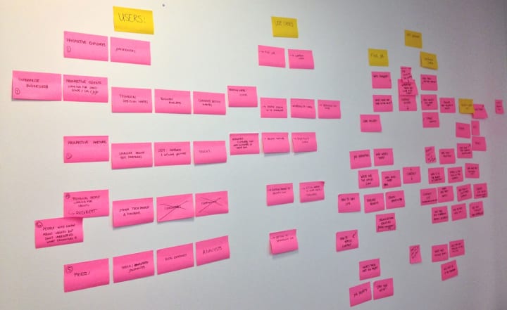
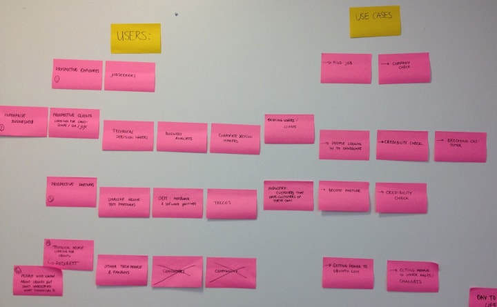
After I spoke to about fifteen people I summarised the key points from each stakeholder on post it notes and put them all up on a wall in one of the meeting rooms in the office. As I took out the duplicates and restructured the remaining notes, I began to see a familiar pattern.
Conclusions
When I finished grouping the different audiences, I ended up with five groups of users: enterprise customers, (potential) partners, job seekers, media (a varied group that includes press, tech analysts and bloggers), open source advocates and the more generic tech enthusiasts that want to know more about the company backing Ubuntu.
As these groups aligned very well with the persona’s and other pieces of research that I had found, I felt comfortable continuing my process by moving on to the user needs and site goals that will help build a good site structure and generate useful content for each group of users.
I found that talking to many experts from within the company helped me quickly understand the full range of requirements, saving me time rather than making my job more complicated. Furthermore I was happy to get a chance to get to know people from different parts of the company so soon after I got started.
In order to keep the project moving forward, we appointed one key stakeholder to sign off each step of the process, but I’m looking forward to showing the end results to the broader group to see if I managed to meet all their expectations. We will also conduct user-testing to ensure the site answers our core audiences questions and allows them to complete their tasks.
I hope to share more about this project in the months to come.


